Continuing to take more creep shots of metro seats! Keeping a running list in my phone of each line I take and any new patterns I see. This week’s additions:
-line 6 had a green to yellow gradient on the fixed seats and teal dots on the fold down seats
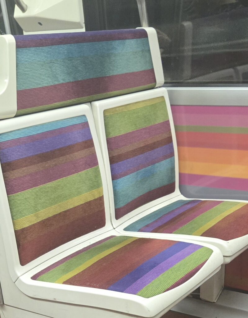
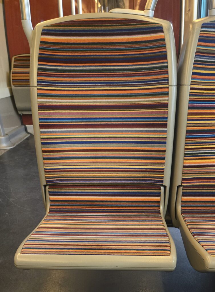
-line 2 had funky colorful stripes (thin), while line 4 had chunky lines in a different color scheme
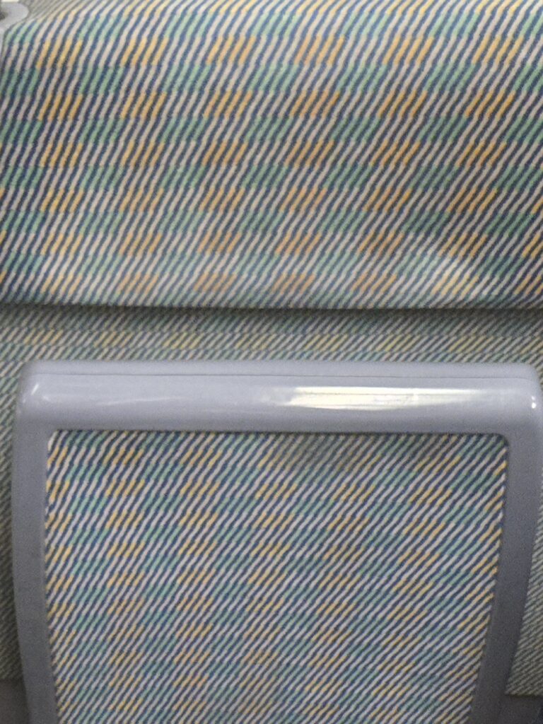
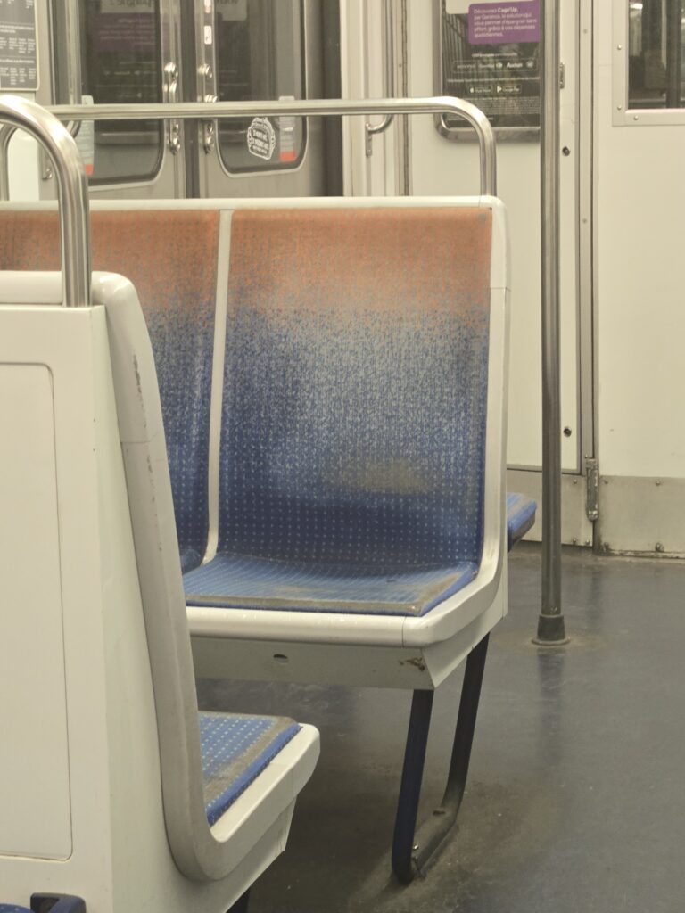
-line 4 also had a crosshatched yellow/purple/teal pattern and a blue to orange dotted gradient
-RER A with an orange background and a contrasting blue branching floral pattern
I love the consistent use of complementary colors and the mix of simpler patterns (gradients and stripes) and more geometric or floral designs. Every time I see a new one I just keep wondering exactly how many there are. Whose job is this? How do I apply to design metro seat fabrics? It just gets me thinking about merchandising psychology and all the things that go into why stores are laid out the way they are. Why these patterns? Who decides? What criteria are they using?
I am probably reading into this too much.